

プロジェクト概要 / Project Overview
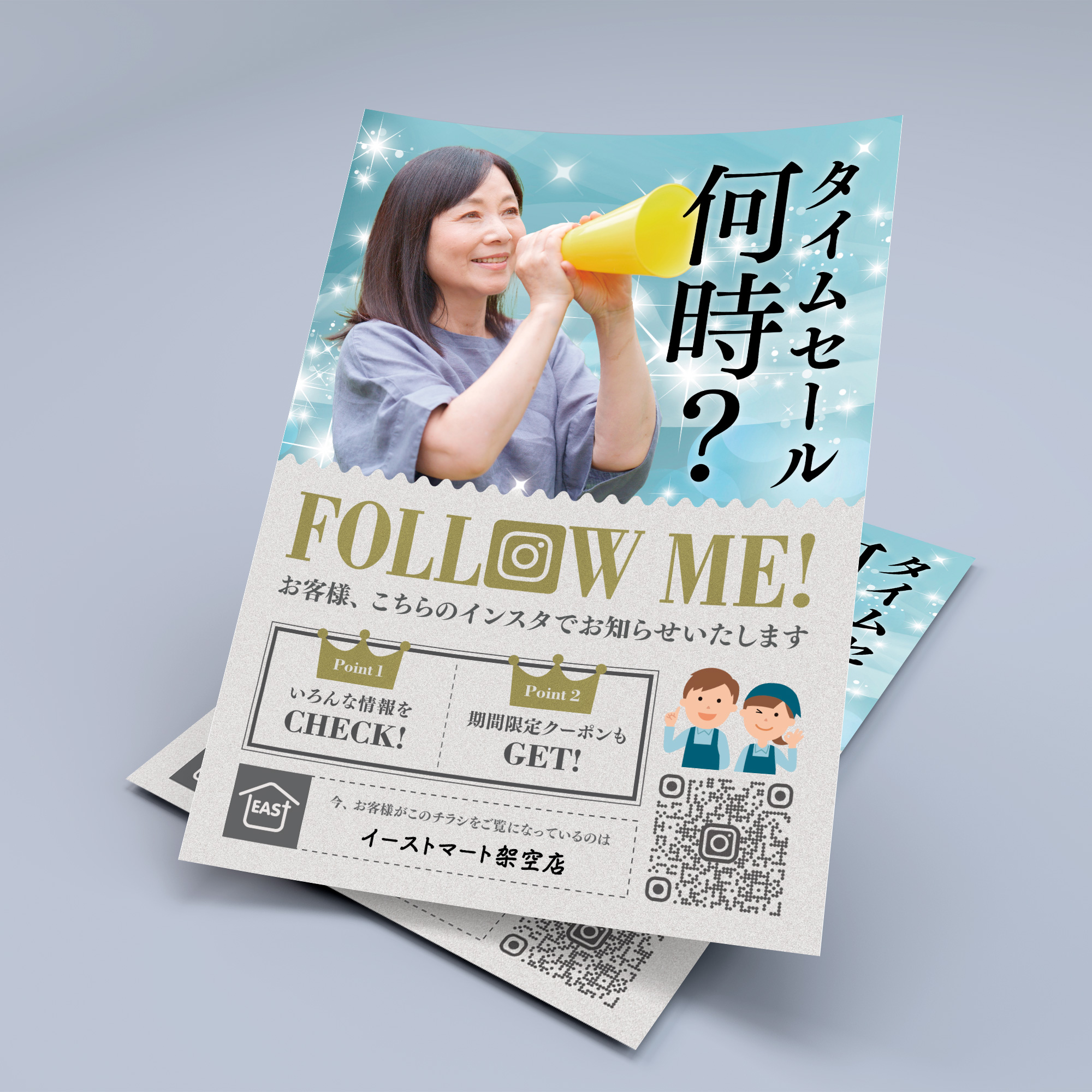
架空のホームセンター「イーストマート」店内掲示用チラシ
A flyer to be displayed in a fictional home improvement store, “Eastmart”
コンセプト・アイデア / Concept and Idea
ホームセンターで買い物し、Instagramを頻繁に使う感度の高い利用客に注目されるデザインを目指しました。
I aimed to create a design that would attract the attention of discerning customers who shop at home improvement stores and frequently use Instagram.
デザイン過程 / Design Process
制作期間 – 3日間
当初は外国人モデルの画像を使い、ウエスタン調のデザインを制作していましたが、家族からの「普通の人をモデルにしてみたら」というアドバイスを受け、ホームセンターの利用客に多そうなタイプの女性モデルの画像を探し、改めて制作を始めました。今度は少女マンガをモチーフにし、キラキラした「普通の主婦」が、子どものスポーツ大会の応援をしながら優雅にタイムセールのことを考えている、という若干シュールな設定にした上で、その主婦に対し店側が丁寧な接客をしているという雰囲気を出すために、フォントをセリフ体にし、ゴールドのテクスチャを使用しています。
Production period – 3 days
Initially, I used images of foreign models and created a western-style design, but after receiving advice from my family to “try using an ordinary person as a model,” I started looking for images of female models who were likely to be frequent customers of home improvement centers and started creating again. This time, I used a shoujo manga motif, with a slightly surreal setting of a sparkling “ordinary housewife” elegantly thinking about time sales while cheering on her child’s sports tournament, and used a serif font and gold texture to create the atmosphere of the store staff politely serving the housewife.
使用したツールや技術 / Tools and Techniques used
Adobe Illustrator CC / Adobe Photoshop。ゴールドのテクスチャはPhotoshopで一から作りました。
Adobe Illustrator CC / Adobe Photoshop. The gold texture was created from scratch in Photoshop.
結果・成果 / Results and Outcomes
ThreadsとInstagramで公開し、一定数の「いいね!」を頂きました。
I posted it on Threads and Instagram and it received a certain number of likes.